As I mentioned in my last post, I’ve been working on an upgrade of my website. This bear is on the new home page.
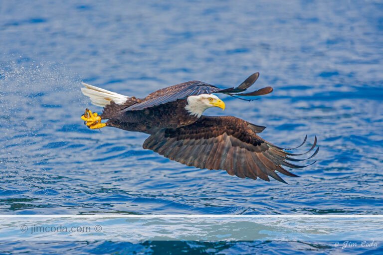
The upgrade consists mainly of making the images larger, roughly three times larger. Converting the images has been taking longer than I like so I’ve decided to go “live” with the new site even though it isn’t finished. I’ve completed the upgrade on the bird portfolios. I’ve also done all or part of some of the mammal portfolios. Because the images are much larger, I’ve been putting my copyright on them. Images that don’t have my copyright haven’t been upgraded yet. (They also look less than ideal because they’ve been “stretched” three times their original size.) Hopefully, I’ll finish the upgrade in the near future.
In addition to larger images, the site is more user-friendly. When you select and open a portfolio you now have a new way to view the images. You can simply use the left and right arrow keys on your keyboard. That wasn’t an option before. You can also click on the arrows on the bottom of the portfolio (like before) or you can click on “slideshow” (also like before) or you can click on “thumbnails.” If you do the latter you can navigate through them by clicking on the vertical bars at each end of the thumbnails to go four thumbnails backward or forward with each click. The old site also had thumbnails, but they were of the scrolling variety which made them hard to control. They were also much smaller. These thumbnails can save a lot of time if you’re looking for a particular type of image. As before, you can read something about each image by clicking on “image info” at the bottom of each image.
I think the site is a nice improvement over the old site. I’d love to hear what you think. To get to the new site you can get the link by clicking on “Portfolio” at the top of this blog or you can simply click here.


0 Responses
Hot dang, Jim! Those big images are gorgeous. I was completely bowled over by your Bald Eagle photos. Fantastic!
Hi John and thank you. The images “scale” or vary in size based on the size of your monitor.
Jim
Lovely shot of this bear! Gorgeous.
Thanks Jen. I hope you’ll look at the website.
That’s a really nice site you’ve created. The grey background stands out from the usual black that many photographers use, like on smugmug. What kind of website tool did you use? It looks like a ton of work.
Your photographs look lovely at a larger size. I’m curious to know why you have a print feature and are also selling prints. And what and how are your prints – type of ink (is it UV protected?), coated, kind of paper, canvas, etc? That information would be good to know for those who are thinking of buying prints. Your shopping cart content needs some fixing, because I can only see “Print Onl -” with no indication of size. One would have to go back to continue shopping to see how prices relate to sizes. The shipping section also needs some fixing. I’m sure you’ll get around to that kind of stuff, and you probably expect people would contact you anyways.
Sorry, I’m not thinking of buying any prints right now. I have photographs sitting around that I haven’t had the time or money to have framed. Professional framing often costs twice as much as the photographs themselves – erg! I recently helped an artist friend build a blog that linked from his website, because he couldn’t figure out his web host’s tools. I also ended up setting him up on paypal, intuit credit card reader, and google maps. It was a pain.
All this is to say, I’m impressed! Best wishes.
Hi Katie. It’s a livebooks site.
Thanks for pointing out the shopping cart glitch. I was unaware of it. It must have happened when I went “live” with the upgraded site last Friday. The “print” feature is for assisting people who may want a hard copy for a layout etc. These images are only 96 ppi and therefore not adequate for a good quality print. The “print Onl” Should be “Print Only – 8×12” etc. with different prices based on size. I print on an Epson 9900. I can print on any media, including canvas. Default paper is Epson Semimatte. Ink and all media are archival.
Thanks again for your comments Katie.
The look on her face has so much emotion — and I love your description of her as dreaming of dryer weather!
Thanks Pat. It rained day and night on that trip. We had no choice but to go out in it all day. I may have had the same look on my face.
I think the bear picture is a great home page Jim. I browsed through your site and it looks great. It loads quickly and the large sized images look fantastic!
Thanks Alan. Winter isn’t too far away and I’m looking forward to some good bobcat and coyote photos at Point Reyes. Hope to see you there.